Typography
Typography carries most of the Deconflict voice. Two typefaces, set with generous size and tight tracking, keep the brand calm, precise and easy to read, whether it is a single word on a dark field or a paragraph of investigative detail.
PP Telegraf
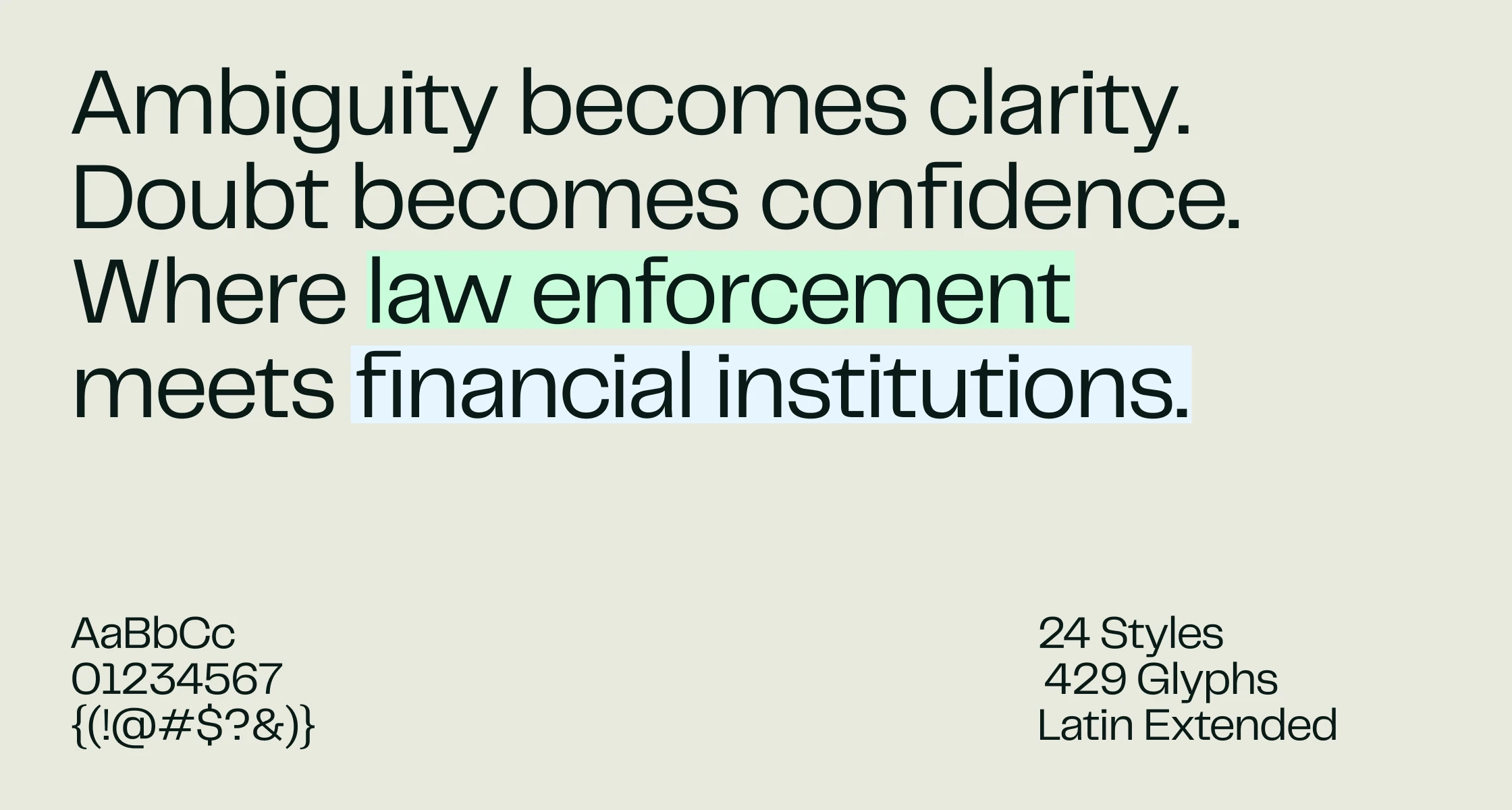
PP Telegraf by Pangram Pangram is the primary typeface. It leads at display sizes, giving headlines, statements and labels their presence.
Instrument Sans
The secondary typeface, used for body copy, captions and interface text where type runs small.
Instrument Sans
Specimens
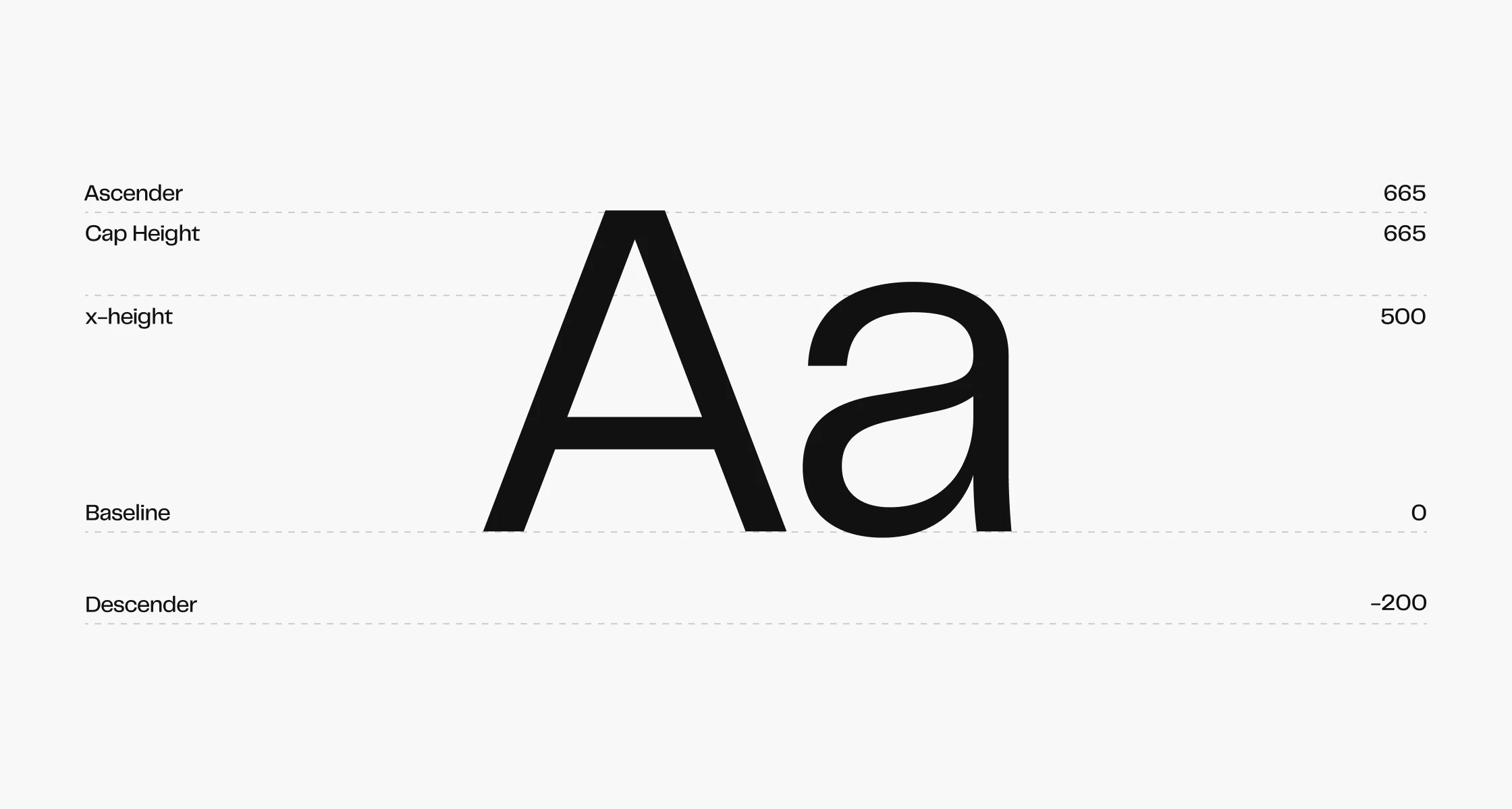
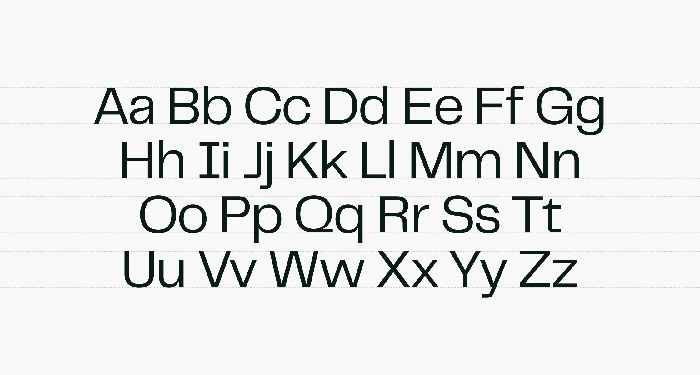
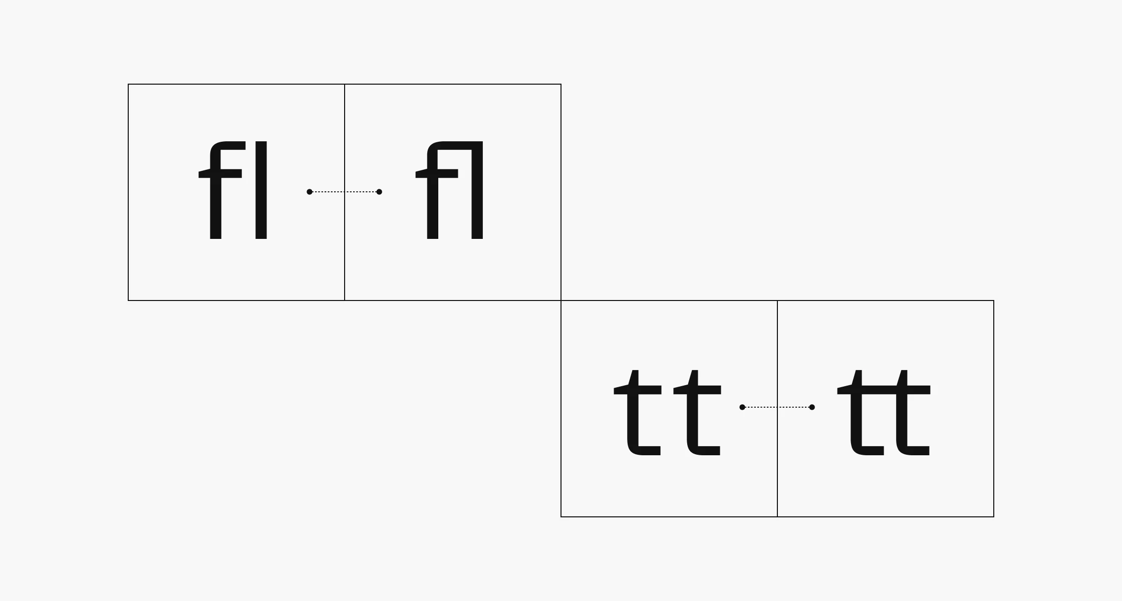
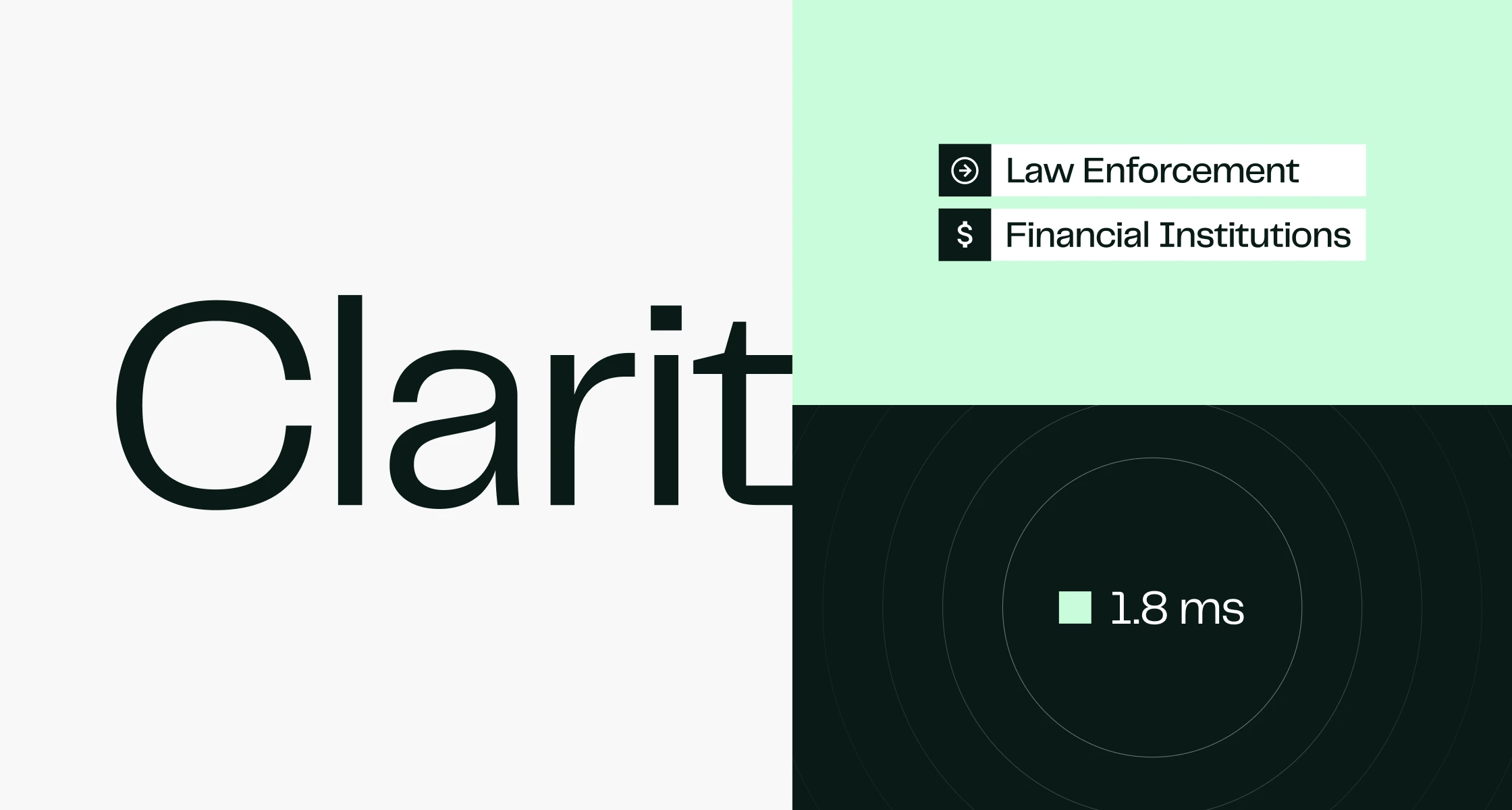
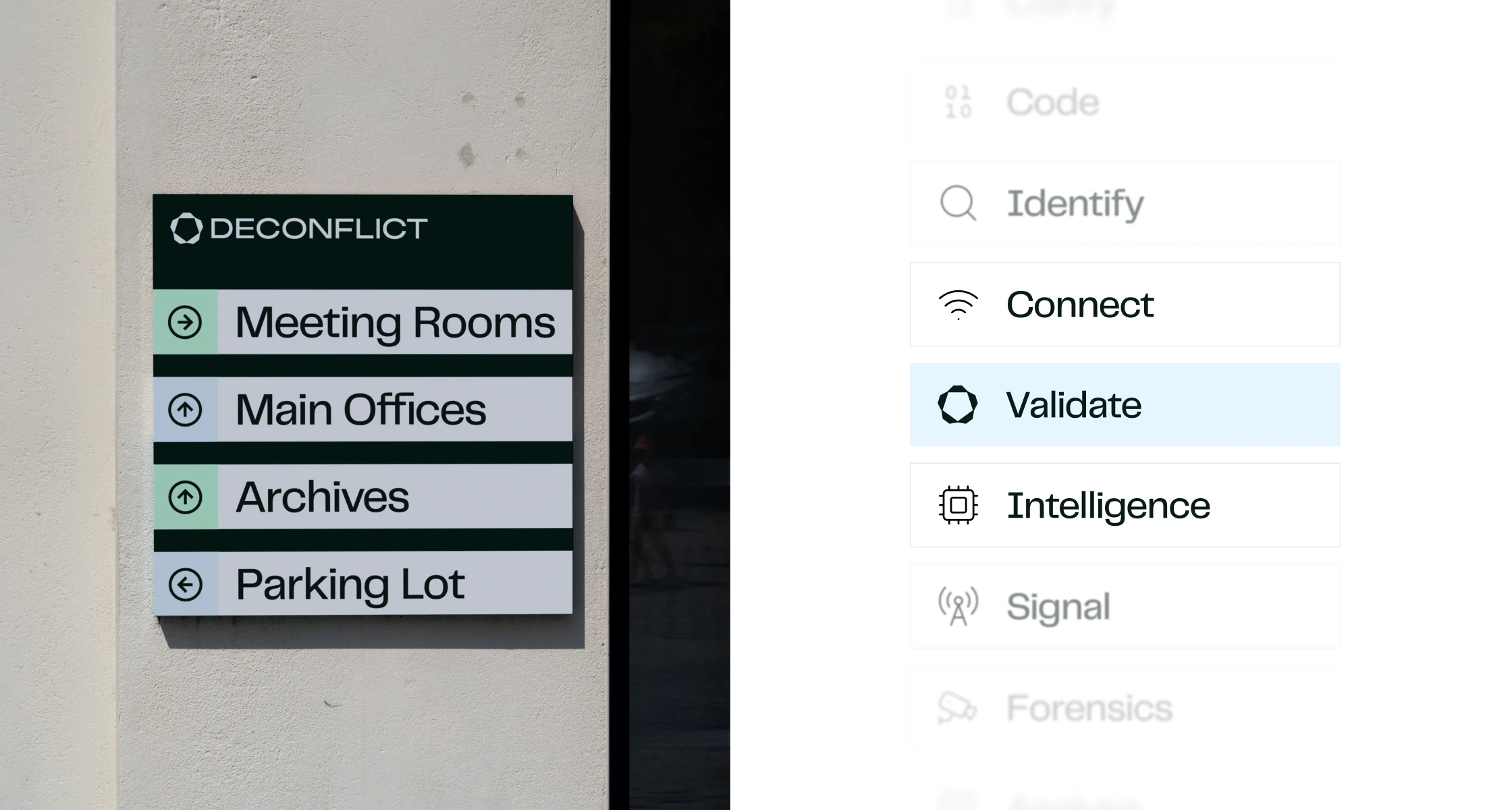
PP Telegraf has a tall x-height, compact ascenders and descenders, and discretionary ligatures for pairs like fl and tt. The character set covers Latin Extended across 24 styles and 429 glyphs. The examples below show the typeface at work across metrics, the alphabet, editorial settings and physical signage.