# Deconflict: documents

This file is everything an AI needs to make on-brand Deconflict one-pagers, posters, reports, invitations and other things that get printed or sent as a PDF. Drop it into the AI you use, then say what you need, for example "a 6-slide deck for our February dinner".

**If you're an AI reading this:** read all of it before making anything. Follow the Rules section over any request. Use only the colours, fonts and images in this file. When a fact isn't in the Facts section or the request, never invent it and never print a placeholder: leave that line, number or row out of the piece, and list what's missing at the end of your reply so they can add it.

## How to make documents

1. Write the one thing the document must get across, then the few points that support it.
2. Pick the size: US Letter (816 × 1056 at 96 dpi) for one-pagers, the size asked for posters. Keep the margins from the rules.
3. Use only the text styles in the tokens.css code in this file, as the Rules section assigns them to print: two sizes for display, the body style for reading. Never scale a style or invent a size.
4. Use the brand colours, the graphic device and only approved images. Facts come from the Facts section only.
5. Set print like Swiss print (U-24): a strict grid, flush left, one sans, hierarchy from size and position, white space; rules and numbers do the structuring, not boxes. On a Letter page body is 12 to 14px, captions 10px, section heads 16 to 21px and one title 32 to 53px: never web-sized type. When it does not fit, cut copy.
6. Make it as HTML at the exact page size, ready to print to PDF, then check it against the checklist.

---

# Templates: start here

Each template is a finished piece a designer approved, at its exact size. **Make every new piece by copying the closest template and editing only what its slot comments allow:** the words (within the character limits), the photo (from the image library, keeping the slot's crop) and the tone where a slot says it may change. Never move, resize, restyle or add elements, and never change what a comment marks as locked. Only when no template fits the request, build from scratch, and then reuse a template's grid, margins, type and spacing exactly.

### onepager-letter: One-pager, US Letter

- Borrows from: the hero (H1: title, intro, then the picture), the benefit cards (D07: three columns) and the brand book's chips (slides 27, 31: an icon in a dark square beside a green label).
- Use it for: a product or company overview to print or send as a PDF.
- Not for: event invitations (use poster-event), more than three sections, facts marked "check".
- Slots: title (2 lines of up to 28 characters), intro (up to 110 characters), photo (crop 816×272), 3 sections (a label up to 18 characters with a Lucide icon, text up to 170 characters), footer line and contact
- Locked: the logo, 64px margins and three 208px columns, 32px apart, the blocks, the chips, every size and colour

```html
<!doctype html>
<html lang="en"><head><meta charset="utf-8"><title>One-pager, US Letter</title>
<style>

@font-face { font-family: "Instrument Sans"; src: url("https://deconflict-brandbook.vercel.app/brandos/fonts/Instrument%20Sans-400.woff2"); font-weight: 400; font-style: normal; font-display: swap; }

:root {
  --font-pp-telegraf: "PP Telegraf", "Instrument Sans", system-ui, sans-serif;
  --font-instrument-sans: "Instrument Sans", system-ui, sans-serif;
  --font-dm-mono: "DM Mono", ui-monospace, monospace;
  --font-brand: var(--font-pp-telegraf);
  --tone-light: #FFFFFF;
  --tone-mist: #FAFAFA;
  --tone-dark: #0A1B17;
  --tone-forest: #112D26;
  --tone-blue: #E7F5FF;
  --tone-beige: #E8EADE;
  --tone-green: #CAFDDB;
  --tone-mint: #DDF7DF;
  --space-4: 4px;
  --space-8: 8px;
  --space-12: 12px;
  --space-16: 16px;
  --space-24: 24px;
  --space-32: 32px;
  --space-40: 40px;
  --space-48: 48px;
  --space-64: 64px;
  --space-80: 80px;
  --space-96: 96px;
  --space-128: 128px;
  --space-160: 160px;
  --space-192: 192px;
  --space-216: 216px;
  --grid-columns: 12;
  --grid-column: 78px;
  --grid-gutter: 24px;
  --grid-margin: 120px;
  --media-fill: rgba(128, 128, 128, 0.12);
  --media-label: rgb(128, 128, 128);
}

/* Text styles: one class per style in the brand's type system. Use these; don't invent sizes. */
.t-display-display-xl { font-family: var(--font-pp-telegraf); font-weight: 400; font-size: 64px; line-height: 1; letter-spacing: -0.02em; }
.t-display-display-lg { font-family: var(--font-pp-telegraf); font-weight: 400; font-size: 48px; line-height: 1; letter-spacing: -0.01em; }
.t-display-display-md { font-family: var(--font-pp-telegraf); font-weight: 400; font-size: 40px; line-height: 1.05; letter-spacing: -0.01em; }
.t-display-display-sm { font-family: var(--font-pp-telegraf); font-weight: 400; font-size: 32px; line-height: 1.1; letter-spacing: -0.01em; }
.t-heading-heading-lg { font-family: var(--font-instrument-sans); font-weight: 400; font-size: 24px; line-height: 1.2; letter-spacing: -0.01em; }
.t-heading-heading-md { font-family: var(--font-instrument-sans); font-weight: 400; font-size: 20px; line-height: 1.2; letter-spacing: -0.01em; }
.t-body-body-lg { font-family: var(--font-instrument-sans); font-weight: 400; font-size: 24px; line-height: 1.4; letter-spacing: -0.01em; }
.t-body-body-md { font-family: var(--font-instrument-sans); font-weight: 400; font-size: 20px; line-height: 1.4; letter-spacing: -0.01em; }
.t-body-body-sm { font-family: var(--font-instrument-sans); font-weight: 400; font-size: 16px; line-height: 1.5; letter-spacing: -0.01em; }
.t-quote-quote { font-family: var(--font-instrument-sans); font-weight: 400; font-size: 40px; line-height: 1.2; letter-spacing: -0.01em; }
.t-link-link-lg { font-family: var(--font-instrument-sans); font-weight: 400; font-size: 24px; line-height: 1.2; letter-spacing: -0.01em; }
.t-link-link-md { font-family: var(--font-instrument-sans); font-weight: 400; font-size: 16px; line-height: 1.2; letter-spacing: -0.01em; }
.t-button-button-md { font-family: var(--font-instrument-sans); font-weight: 400; font-size: 16px; line-height: 1.2; letter-spacing: -0.01em; }
.t-label-label-sm { font-family: var(--font-instrument-sans); font-weight: 400; font-size: 14px; line-height: 1.4; }
.t-eyebrow-eyebrow { font-family: var(--font-dm-mono); font-weight: 400; font-size: 12px; line-height: 1.4; letter-spacing: 0.1em; }
.t-format-display-144 { font-family: var(--font-pp-telegraf); font-weight: 400; font-size: 144px; line-height: 1; letter-spacing: -0.03em; }
.t-format-display-144-highlight { font-family: var(--font-pp-telegraf); font-weight: 400; font-size: 144px; line-height: 1.2; letter-spacing: -0.03em; }
.t-format-display-96 { font-family: var(--font-pp-telegraf); font-weight: 400; font-size: 96px; line-height: 1.05; letter-spacing: -0.02em; }
.t-format-display-96-highlight { font-family: var(--font-pp-telegraf); font-weight: 400; font-size: 96px; line-height: 1.2; letter-spacing: -0.02em; }
.t-format-text-48 { font-family: var(--font-instrument-sans); font-weight: 400; font-size: 48px; line-height: 1.3; letter-spacing: -0.01em; }

/* Tones: a section's background. Each layout's own rules set its text colours per tone. */
.tone-light { background: var(--tone-light); }
.tone-mist { background: var(--tone-mist); }
.tone-dark { background: var(--tone-dark); }
.tone-forest { background: var(--tone-forest); }
.tone-blue { background: var(--tone-blue); }
.tone-beige { background: var(--tone-beige); }
.tone-green { background: var(--tone-green); }
.tone-mint { background: var(--tone-mint); }

/* Empty media boxes: what goes there is in the label ("Photo, 640×480"). Replace with the real image at that size. */
.media { position: relative; background: var(--media-fill); }
.media__label { position: absolute; left: 50%; top: 50%; transform: translate(-50%, -50%); white-space: nowrap; font: 400 14px/1.2 var(--font-label, var(--font-brand)); color: var(--media-label); pointer-events: none; }
.media__label--corner { left: 24px; top: 24px; transform: none; }

*, *::before, *::after { box-sizing: border-box; }
body { margin: 0; }
img { display: block; }
hr { border: 0; margin: 0; }
[hidden] { display: none !important; }
/* this master */
.piece{position:relative;overflow:hidden;font-variant-ligatures:none}.piece>*{position:absolute}.piece *{margin:0}.piece img{object-fit:cover}h1,h2{text-wrap:balance}p{text-wrap:pretty}.hl{background:linear-gradient(var(--h,var(--tone-green)) 0 0) 0 100%/100% 1.08em no-repeat;padding:0 .15em;-webkit-box-decoration-break:clone;box-decoration-break:clone}.hl.s{margin-left:-.15em}
.c{top:720px;width:208px}.k{display:inline-flex;border-radius:4px;overflow:hidden;margin-bottom:16px}.k svg{width:24px;height:24px;padding:4px;background:var(--tone-dark);stroke:var(--tone-light);fill:none;stroke-width:1.5}.k span{background:var(--tone-green);padding:0 8px}</style></head>
<body style="margin:0">
<div class="piece tone-light" style="width:816px;height:1056px;color:var(--tone-dark)">
<!-- locked: logo -->
<svg style="left:64px;top:64px;width:197px;height:24px" viewBox="0 0 1248 152" fill="currentColor" role="img" aria-label="Deconflict"><path d="M199 28H255C282 28 301 48 301 76C301 104 282 124 255 124H199V28ZM249 109C271 109 284 96 284 76C284 56 271 43 249 43H215V109H249ZM318 28H404V42H335V69H402V82H335V110H404V124H318V28ZM417 76C417 45 441 25 474 25C504 25 526 42 528 64H511C509 53 495 41 474 41C450 41 434 55 434 76C434 96 450 111 474 111C495 111 509 99 511 87H528C526 110 504 127 474 127C441 127 417 107 417 76V76ZM543 76C543 45 565 25 600 25C636 25 658 45 658 76C658 106 635 127 600 127C565 127 543 107 543 76ZM600 111C625 111 641 97 641 76C641 55 626 40 600 40C575 40 560 55 560 76C560 97 575 111 600 111ZM674 28H698L764 108V28H780V124H756L690 44V124H674V28H674ZM801 28H886V43H817V74H879V90H817V124H801V28H801ZM902 28H919V109H984V124H902V28ZM998 28H1015V124H998V28ZM1031 76C1031 45 1054 25 1087 25C1117 25 1139 42 1141 64H1124C1122 53 1108 41 1087 41C1063 41 1048 55 1048 76C1048 96 1063 111 1087 111C1108 111 1122 99 1124 87H1141C1139 110 1117 127 1087 127C1054 127 1031 107 1031 76V76ZM1147 28H1248V43H1206V124H1189V43H1147V28ZM149 38L120 23L96 0H63L40 24L10 38L0 70L15 100L20 132L47 152L80 147L112 152L139 132L144 99L159 70L149 38H149ZM123 110L96 130L80 142L63 130L36 110L20 98L26 79L36 47L42 27H117L123 47L133 79L140 98L123 110H123Z"/></svg>
<!-- slot: title, 2 lines -->
<h1 class="t-display-display-sm" style="left:64px;top:152px;width:688px">Your systems identify risk.<br>We identify intelligence.</h1>
<!-- slot: intro -->
<p class="t-body-body-sm" style="left:64px;top:246px;width:453px">Deconflict tells a bank whether a crypto wallet is already under investigation by law enforcement.</p>
<!-- slot: photo, full width -->
<img src="https://deconflict-brandbook.vercel.app/brandos/images/character-office.jpg" alt="An investigator at a laptop in a warm office" style="left:0;top:368px;width:816px;height:272px;object-position:50% 30%">
<!-- locked: colour blocks -->
<i class="tone-blue" style="right:0;top:368px;width:200px;height:48px"></i>
<i class="tone-green" style="left:0;top:592px;width:298px;height:48px"></i>
<i class="tone-beige" style="right:0;top:640px;width:80px;height:40px"></i>
<!-- slot: sections, 3 columns -->
<div class="c t-body-body-sm" style="left:64px"><p class="k"><svg viewBox="0 0 24 24"><path d="M2 12s3.6-7 10-7 10 7 10 7-3.6 7-10 7S2 12 2 12"/><circle cx="12" cy="12" r="3"/></svg><span>The problem</span></p><p>Today an investigation can’t be revealed. So the bank doesn’t know, the best it can do is guess, and the money&nbsp;disappears.</p></div>
<div class="c t-body-body-sm" style="left:304px"><p class="k"><svg viewBox="0 0 24 24"><path d="M20 13c0 5-3.5 7.5-7.7 9-4.2-1.5-8.3-4-8.3-9V6c2 0 5-1.2 8-3.7C15 4.8 18 6 20 6z"/><path d="m9 12 2 2 4-4"/></svg><span>How it works</span></p><p>Every flag comes from a real investigator: known, reachable and secure. We never make the decision. We give investigators the confidence to make it.</p></div>
<div class="c t-body-body-sm" style="left:544px"><p class="k"><svg viewBox="0 0 24 24"><path d="M5 12h14M12 5l7 7-7 7"/></svg><span>What happens next</span></p><p>One answer leads to immediate action: freeze the funds, request the subpoena, recover the money, protect the victim.</p></div>
<!-- slot: footer, the brand line and the contact -->
<p class="t-body-body-sm" style="left:64px;bottom:64px;width:440px;padding-top:16px;border-top:1px solid var(--tone-dark)">Ambiguity becomes clarity. Doubt becomes confidence.</p>
<!-- slot: contact (from the request, bottom right, above a rule; left out when the request gives none) -->
</div>
</body></html>
```

### poster-brand: Brand poster

- Borrows from: the event wall and stage in the brand book (slides 44, 51: "Ambiguity becomes clarity." large, with blocks) and the annual report cover (slide 50).
- Use it for: trade-show walls, office posters, a brand moment in print.
- Not for: event details (use poster-event), more than one line of copy.
- Slots: headline (3 lines of up to 10 characters; the last phrase highlighted), photo (kind character; crop 1191×791, face at 75% 30%)
- Locked: the logo, the 12 × 17 grid (one unit is 1191/12 = 99.25px, margins one unit), the blocks, every size and colour

```html
<!doctype html>
<html lang="en"><head><meta charset="utf-8"><title>Brand poster</title>
<style>

@font-face { font-family: "Instrument Sans"; src: url("https://deconflict-brandbook.vercel.app/brandos/fonts/Instrument%20Sans-400.woff2"); font-weight: 400; font-style: normal; font-display: swap; }

:root {
  --font-pp-telegraf: "PP Telegraf", "Instrument Sans", system-ui, sans-serif;
  --font-instrument-sans: "Instrument Sans", system-ui, sans-serif;
  --font-dm-mono: "DM Mono", ui-monospace, monospace;
  --font-brand: var(--font-pp-telegraf);
  --tone-light: #FFFFFF;
  --tone-mist: #FAFAFA;
  --tone-dark: #0A1B17;
  --tone-forest: #112D26;
  --tone-blue: #E7F5FF;
  --tone-beige: #E8EADE;
  --tone-green: #CAFDDB;
  --tone-mint: #DDF7DF;
  --space-4: 4px;
  --space-8: 8px;
  --space-12: 12px;
  --space-16: 16px;
  --space-24: 24px;
  --space-32: 32px;
  --space-40: 40px;
  --space-48: 48px;
  --space-64: 64px;
  --space-80: 80px;
  --space-96: 96px;
  --space-128: 128px;
  --space-160: 160px;
  --space-192: 192px;
  --space-216: 216px;
  --grid-columns: 12;
  --grid-column: 78px;
  --grid-gutter: 24px;
  --grid-margin: 120px;
  --media-fill: rgba(128, 128, 128, 0.12);
  --media-label: rgb(128, 128, 128);
}

/* Text styles: one class per style in the brand's type system. Use these; don't invent sizes. */
.t-display-display-xl { font-family: var(--font-pp-telegraf); font-weight: 400; font-size: 64px; line-height: 1; letter-spacing: -0.02em; }
.t-display-display-lg { font-family: var(--font-pp-telegraf); font-weight: 400; font-size: 48px; line-height: 1; letter-spacing: -0.01em; }
.t-display-display-md { font-family: var(--font-pp-telegraf); font-weight: 400; font-size: 40px; line-height: 1.05; letter-spacing: -0.01em; }
.t-display-display-sm { font-family: var(--font-pp-telegraf); font-weight: 400; font-size: 32px; line-height: 1.1; letter-spacing: -0.01em; }
.t-heading-heading-lg { font-family: var(--font-instrument-sans); font-weight: 400; font-size: 24px; line-height: 1.2; letter-spacing: -0.01em; }
.t-heading-heading-md { font-family: var(--font-instrument-sans); font-weight: 400; font-size: 20px; line-height: 1.2; letter-spacing: -0.01em; }
.t-body-body-lg { font-family: var(--font-instrument-sans); font-weight: 400; font-size: 24px; line-height: 1.4; letter-spacing: -0.01em; }
.t-body-body-md { font-family: var(--font-instrument-sans); font-weight: 400; font-size: 20px; line-height: 1.4; letter-spacing: -0.01em; }
.t-body-body-sm { font-family: var(--font-instrument-sans); font-weight: 400; font-size: 16px; line-height: 1.5; letter-spacing: -0.01em; }
.t-quote-quote { font-family: var(--font-instrument-sans); font-weight: 400; font-size: 40px; line-height: 1.2; letter-spacing: -0.01em; }
.t-link-link-lg { font-family: var(--font-instrument-sans); font-weight: 400; font-size: 24px; line-height: 1.2; letter-spacing: -0.01em; }
.t-link-link-md { font-family: var(--font-instrument-sans); font-weight: 400; font-size: 16px; line-height: 1.2; letter-spacing: -0.01em; }
.t-button-button-md { font-family: var(--font-instrument-sans); font-weight: 400; font-size: 16px; line-height: 1.2; letter-spacing: -0.01em; }
.t-label-label-sm { font-family: var(--font-instrument-sans); font-weight: 400; font-size: 14px; line-height: 1.4; }
.t-eyebrow-eyebrow { font-family: var(--font-dm-mono); font-weight: 400; font-size: 12px; line-height: 1.4; letter-spacing: 0.1em; }
.t-format-display-144 { font-family: var(--font-pp-telegraf); font-weight: 400; font-size: 144px; line-height: 1; letter-spacing: -0.03em; }
.t-format-display-144-highlight { font-family: var(--font-pp-telegraf); font-weight: 400; font-size: 144px; line-height: 1.2; letter-spacing: -0.03em; }
.t-format-display-96 { font-family: var(--font-pp-telegraf); font-weight: 400; font-size: 96px; line-height: 1.05; letter-spacing: -0.02em; }
.t-format-display-96-highlight { font-family: var(--font-pp-telegraf); font-weight: 400; font-size: 96px; line-height: 1.2; letter-spacing: -0.02em; }
.t-format-text-48 { font-family: var(--font-instrument-sans); font-weight: 400; font-size: 48px; line-height: 1.3; letter-spacing: -0.01em; }

/* Tones: a section's background. Each layout's own rules set its text colours per tone. */
.tone-light { background: var(--tone-light); }
.tone-mist { background: var(--tone-mist); }
.tone-dark { background: var(--tone-dark); }
.tone-forest { background: var(--tone-forest); }
.tone-blue { background: var(--tone-blue); }
.tone-beige { background: var(--tone-beige); }
.tone-green { background: var(--tone-green); }
.tone-mint { background: var(--tone-mint); }

/* Empty media boxes: what goes there is in the label ("Photo, 640×480"). Replace with the real image at that size. */
.media { position: relative; background: var(--media-fill); }
.media__label { position: absolute; left: 50%; top: 50%; transform: translate(-50%, -50%); white-space: nowrap; font: 400 14px/1.2 var(--font-label, var(--font-brand)); color: var(--media-label); pointer-events: none; }
.media__label--corner { left: 24px; top: 24px; transform: none; }

*, *::before, *::after { box-sizing: border-box; }
body { margin: 0; }
img { display: block; }
hr { border: 0; margin: 0; }
[hidden] { display: none !important; }
/* this master */
.piece{position:relative;overflow:hidden;font-variant-ligatures:none}.piece>*{position:absolute}.piece *{margin:0}.piece img{object-fit:cover}h1,h2{text-wrap:balance}p{text-wrap:pretty}.hl{background:linear-gradient(var(--h,var(--tone-green)) 0 0) 0 100%/100% 1.08em no-repeat;padding:0 .15em;-webkit-box-decoration-break:clone;box-decoration-break:clone}.hl.s{margin-left:-.15em}</style></head>
<body style="margin:0">
<div class="piece tone-light" style="width:1191px;height:1684px;color:var(--tone-dark)">
<!-- slot: photo, the bottom 8 units, full bleed -->
<img src="https://deconflict-brandbook.vercel.app/brandos/images/eye-screen.jpg" alt="An eye behind glasses, reading a screen" style="left:0;top:893px;width:1191px;height:791px;object-position:52% 45%">
<!-- locked: colour blocks, whole grid units -->
<i class="tone-blue" style="right:0;top:695px;width:99px;height:99px"></i>
<i class="tone-beige" style="right:0;top:794px;width:298px;height:99px"></i>
<i class="tone-green" style="left:0;top:893px;width:397px;height:99px"></i>
<i class="tone-green" style="right:0;top:1585px;width:198px;height:99px"></i>
<!-- locked: logo -->
<svg style="left:99px;top:99px;width:328px;height:40px" viewBox="0 0 1248 152" fill="currentColor" role="img" aria-label="Deconflict"><path d="M199 28H255C282 28 301 48 301 76C301 104 282 124 255 124H199V28ZM249 109C271 109 284 96 284 76C284 56 271 43 249 43H215V109H249ZM318 28H404V42H335V69H402V82H335V110H404V124H318V28ZM417 76C417 45 441 25 474 25C504 25 526 42 528 64H511C509 53 495 41 474 41C450 41 434 55 434 76C434 96 450 111 474 111C495 111 509 99 511 87H528C526 110 504 127 474 127C441 127 417 107 417 76V76ZM543 76C543 45 565 25 600 25C636 25 658 45 658 76C658 106 635 127 600 127C565 127 543 107 543 76ZM600 111C625 111 641 97 641 76C641 55 626 40 600 40C575 40 560 55 560 76C560 97 575 111 600 111ZM674 28H698L764 108V28H780V124H756L690 44V124H674V28H674ZM801 28H886V43H817V74H879V90H817V124H801V28H801ZM902 28H919V109H984V124H902V28ZM998 28H1015V124H998V28ZM1031 76C1031 45 1054 25 1087 25C1117 25 1139 42 1141 64H1124C1122 53 1108 41 1087 41C1063 41 1048 55 1048 76C1048 96 1063 111 1087 111C1108 111 1122 99 1124 87H1141C1139 110 1117 127 1087 127C1054 127 1031 107 1031 76V76ZM1147 28H1248V43H1206V124H1189V43H1147V28ZM149 38L120 23L96 0H63L40 24L10 38L0 70L15 100L20 132L47 152L80 147L112 152L139 132L144 99L159 70L149 38H149ZM123 110L96 130L80 142L63 130L36 110L20 98L26 79L36 47L42 27H117L123 47L133 79L140 98L123 110H123Z"/></svg>
<!-- slot: headline, 3 lines, highlight on the last phrase -->
<h1 class="t-format-display-144-highlight" style="left:99px;top:298px;width:993px">Ambiguity<br>becomes<br><span class="hl s">clarity.</span></h1>
</div>
</body></html>
```

### poster-event: Event poster

- Borrows from: brand book slide 11 (new-york, "When banks act and agencies coordinate") and the value on forest (D03: one idea on dark).
- Use it for: a roundtable, talk, dinner or webinar: what it is about, when, where, how to join.
- Not for: dates, places or links that aren't confirmed (the request gives them, or the row is deleted), more than three detail rows.
- Slots: headline (the session's question or title, 3 lines of up to 15 characters), details (3 rows: a label up to 6 characters, a value up to 32), photo (kind photo; crop 1191×794)
- Locked: the logo and its green block, the 12 × 17 grid (one unit 99.25px), the blocks, every size and colour

```html
<!doctype html>
<html lang="en"><head><meta charset="utf-8"><title>Event poster</title>
<style>

@font-face { font-family: "Instrument Sans"; src: url("https://deconflict-brandbook.vercel.app/brandos/fonts/Instrument%20Sans-400.woff2"); font-weight: 400; font-style: normal; font-display: swap; }

:root {
  --font-pp-telegraf: "PP Telegraf", "Instrument Sans", system-ui, sans-serif;
  --font-instrument-sans: "Instrument Sans", system-ui, sans-serif;
  --font-dm-mono: "DM Mono", ui-monospace, monospace;
  --font-brand: var(--font-pp-telegraf);
  --tone-light: #FFFFFF;
  --tone-mist: #FAFAFA;
  --tone-dark: #0A1B17;
  --tone-forest: #112D26;
  --tone-blue: #E7F5FF;
  --tone-beige: #E8EADE;
  --tone-green: #CAFDDB;
  --tone-mint: #DDF7DF;
  --space-4: 4px;
  --space-8: 8px;
  --space-12: 12px;
  --space-16: 16px;
  --space-24: 24px;
  --space-32: 32px;
  --space-40: 40px;
  --space-48: 48px;
  --space-64: 64px;
  --space-80: 80px;
  --space-96: 96px;
  --space-128: 128px;
  --space-160: 160px;
  --space-192: 192px;
  --space-216: 216px;
  --grid-columns: 12;
  --grid-column: 78px;
  --grid-gutter: 24px;
  --grid-margin: 120px;
  --media-fill: rgba(128, 128, 128, 0.12);
  --media-label: rgb(128, 128, 128);
}

/* Text styles: one class per style in the brand's type system. Use these; don't invent sizes. */
.t-display-display-xl { font-family: var(--font-pp-telegraf); font-weight: 400; font-size: 64px; line-height: 1; letter-spacing: -0.02em; }
.t-display-display-lg { font-family: var(--font-pp-telegraf); font-weight: 400; font-size: 48px; line-height: 1; letter-spacing: -0.01em; }
.t-display-display-md { font-family: var(--font-pp-telegraf); font-weight: 400; font-size: 40px; line-height: 1.05; letter-spacing: -0.01em; }
.t-display-display-sm { font-family: var(--font-pp-telegraf); font-weight: 400; font-size: 32px; line-height: 1.1; letter-spacing: -0.01em; }
.t-heading-heading-lg { font-family: var(--font-instrument-sans); font-weight: 400; font-size: 24px; line-height: 1.2; letter-spacing: -0.01em; }
.t-heading-heading-md { font-family: var(--font-instrument-sans); font-weight: 400; font-size: 20px; line-height: 1.2; letter-spacing: -0.01em; }
.t-body-body-lg { font-family: var(--font-instrument-sans); font-weight: 400; font-size: 24px; line-height: 1.4; letter-spacing: -0.01em; }
.t-body-body-md { font-family: var(--font-instrument-sans); font-weight: 400; font-size: 20px; line-height: 1.4; letter-spacing: -0.01em; }
.t-body-body-sm { font-family: var(--font-instrument-sans); font-weight: 400; font-size: 16px; line-height: 1.5; letter-spacing: -0.01em; }
.t-quote-quote { font-family: var(--font-instrument-sans); font-weight: 400; font-size: 40px; line-height: 1.2; letter-spacing: -0.01em; }
.t-link-link-lg { font-family: var(--font-instrument-sans); font-weight: 400; font-size: 24px; line-height: 1.2; letter-spacing: -0.01em; }
.t-link-link-md { font-family: var(--font-instrument-sans); font-weight: 400; font-size: 16px; line-height: 1.2; letter-spacing: -0.01em; }
.t-button-button-md { font-family: var(--font-instrument-sans); font-weight: 400; font-size: 16px; line-height: 1.2; letter-spacing: -0.01em; }
.t-label-label-sm { font-family: var(--font-instrument-sans); font-weight: 400; font-size: 14px; line-height: 1.4; }
.t-eyebrow-eyebrow { font-family: var(--font-dm-mono); font-weight: 400; font-size: 12px; line-height: 1.4; letter-spacing: 0.1em; }
.t-format-display-144 { font-family: var(--font-pp-telegraf); font-weight: 400; font-size: 144px; line-height: 1; letter-spacing: -0.03em; }
.t-format-display-144-highlight { font-family: var(--font-pp-telegraf); font-weight: 400; font-size: 144px; line-height: 1.2; letter-spacing: -0.03em; }
.t-format-display-96 { font-family: var(--font-pp-telegraf); font-weight: 400; font-size: 96px; line-height: 1.05; letter-spacing: -0.02em; }
.t-format-display-96-highlight { font-family: var(--font-pp-telegraf); font-weight: 400; font-size: 96px; line-height: 1.2; letter-spacing: -0.02em; }
.t-format-text-48 { font-family: var(--font-instrument-sans); font-weight: 400; font-size: 48px; line-height: 1.3; letter-spacing: -0.01em; }

/* Tones: a section's background. Each layout's own rules set its text colours per tone. */
.tone-light { background: var(--tone-light); }
.tone-mist { background: var(--tone-mist); }
.tone-dark { background: var(--tone-dark); }
.tone-forest { background: var(--tone-forest); }
.tone-blue { background: var(--tone-blue); }
.tone-beige { background: var(--tone-beige); }
.tone-green { background: var(--tone-green); }
.tone-mint { background: var(--tone-mint); }

/* Empty media boxes: what goes there is in the label ("Photo, 640×480"). Replace with the real image at that size. */
.media { position: relative; background: var(--media-fill); }
.media__label { position: absolute; left: 50%; top: 50%; transform: translate(-50%, -50%); white-space: nowrap; font: 400 14px/1.2 var(--font-label, var(--font-brand)); color: var(--media-label); pointer-events: none; }
.media__label--corner { left: 24px; top: 24px; transform: none; }

*, *::before, *::after { box-sizing: border-box; }
body { margin: 0; }
img { display: block; }
hr { border: 0; margin: 0; }
[hidden] { display: none !important; }
/* this master */
.piece{position:relative;overflow:hidden;font-variant-ligatures:none}.piece>*{position:absolute}.piece *{margin:0}.piece img{object-fit:cover}h1,h2{text-wrap:balance}p{text-wrap:pretty}.hl{background:linear-gradient(var(--h,var(--tone-green)) 0 0) 0 100%/100% 1.08em no-repeat;padding:0 .15em;-webkit-box-decoration-break:clone;box-decoration-break:clone}.hl.s{margin-left:-.15em}
dl{left:99px;bottom:99px;display:grid;grid-template-columns:199px 794px;gap:16px 0}dt{color:var(--tone-green)}dd{margin:0}</style></head>
<body style="margin:0">
<div class="piece tone-dark" style="width:1191px;height:1684px;color:var(--tone-light)">
<!-- slot: photo, the top 8 units, full bleed -->
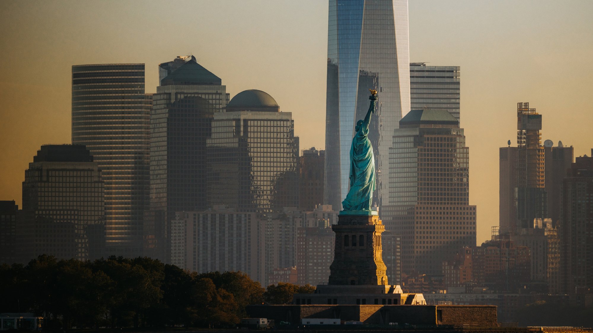
<img src="https://deconflict-brandbook.vercel.app/brandos/images/new-york.jpg" alt="Lower Manhattan and the Statue of Liberty at golden hour" style="left:0;top:0;width:1191px;height:794px;object-position:62% 55%">
<!-- locked: colour blocks, whole grid units -->
<i class="tone-green" style="left:0;top:0;width:496px;height:198px"></i>
<i class="tone-blue" style="right:0;top:695px;width:298px;height:99px"></i>
<i class="tone-forest" style="right:0;top:794px;width:198px;height:198px"></i>
<!-- locked: logo -->
<svg style="left:99px;top:99px;width:328px;height:40px;color:var(--tone-dark)" viewBox="0 0 1248 152" fill="currentColor" role="img" aria-label="Deconflict"><path d="M199 28H255C282 28 301 48 301 76C301 104 282 124 255 124H199V28ZM249 109C271 109 284 96 284 76C284 56 271 43 249 43H215V109H249ZM318 28H404V42H335V69H402V82H335V110H404V124H318V28ZM417 76C417 45 441 25 474 25C504 25 526 42 528 64H511C509 53 495 41 474 41C450 41 434 55 434 76C434 96 450 111 474 111C495 111 509 99 511 87H528C526 110 504 127 474 127C441 127 417 107 417 76V76ZM543 76C543 45 565 25 600 25C636 25 658 45 658 76C658 106 635 127 600 127C565 127 543 107 543 76ZM600 111C625 111 641 97 641 76C641 55 626 40 600 40C575 40 560 55 560 76C560 97 575 111 600 111ZM674 28H698L764 108V28H780V124H756L690 44V124H674V28H674ZM801 28H886V43H817V74H879V90H817V124H801V28H801ZM902 28H919V109H984V124H902V28ZM998 28H1015V124H998V28ZM1031 76C1031 45 1054 25 1087 25C1117 25 1139 42 1141 64H1124C1122 53 1108 41 1087 41C1063 41 1048 55 1048 76C1048 96 1063 111 1087 111C1108 111 1122 99 1124 87H1141C1139 110 1117 127 1087 127C1054 127 1031 107 1031 76V76ZM1147 28H1248V43H1206V124H1189V43H1147V28ZM149 38L120 23L96 0H63L40 24L10 38L0 70L15 100L20 132L47 152L80 147L112 152L139 132L144 99L159 70L149 38H149ZM123 110L96 130L80 142L63 130L36 110L20 98L26 79L36 47L42 27H117L123 47L133 79L140 98L123 110H123Z"/></svg>
<!-- slot: headline, 3 lines -->
<h1 class="t-format-display-96" style="left:99px;top:893px;width:894px">Is this wallet<br>already under<br>investigation?</h1>
<!-- slot: details, 3 rows -->
<dl class="t-format-text-48">
<!-- rows: example values: replace each with the one the request gives; a row the request does not give is deleted, never filled with a placeholder -->
<dt>When</dt><dd>Thursday 4 December, 6 pm</dd>
<dt>Where</dt><dd>Arlington, Virginia</dd>
<dt>Join</dt><dd>Reply to your invitation</dd>
</dl>
</div>
</body></html>
```

---

# Fonts

| Font | Use | Where it comes from | If it isn't available |
| --- | --- | --- | --- |
| PP Telegraf | Display: headlines, quotes, the call to action | Licensed (Pangram Pangram). tokens.css loads it from the brand book; nothing to install, and never use a copy from your own machine. | Instrument Sans at the same size, tracking -2%, only if the font fails to load |
| Instrument Sans | Text: body, headings under 32px, links, buttons, labels | Free, Google Fonts | none needed |
| DM Mono | Eyebrows only (the small labels above section headings) | Free, Google Fonts | none needed |

In an artifact or prototype, load the free ones like this; keep the licensed face first in each font stack so it's used where it's installed:

```html
<link href="https://fonts.googleapis.com/css2?family=Instrument+Sans:wght@400;500&display=swap" rel="stylesheet">
<link href="https://fonts.googleapis.com/css2?family=DM+Mono&display=swap" rel="stylesheet">
```

---

# Deconflict identity

The logo, the mark, the colour blocks and how the brand shows up beyond the website. From the brand book (Brandbook page) and its logo boards.

## The logo

The wordmark DECONFLICT with the mark to its left. The mark is a seven-sided ring: agencies and institutions coming together around one point of clarity (the brand book: "constructed around the concept of agencies and institutions coming together to create clarity").

Use the SVG as it is; it takes its colour from `color` (`fill="currentColor"`). Never redraw, stretch, outline or recolour it outside the pairings below.

```svg
<svg width="1248" height="152" viewBox="0 0 1248 152" fill="none" xmlns="http://www.w3.org/2000/svg">
<path d="M198.7 27.5H255.4C281.8 27.5 301.3 47.9 301.3 75.7C301.3 103.5 281.8 124.1 255.4 124.1H198.7V27.5ZM249.1 108.6C270.5 108.6 284.4 95.6 284.4 75.7C284.4 55.8 270.5 43.0 249.1 43.0H215.2V108.6H249.1Z" fill="black"/>
<path d="M318.3 27.5H404.0V41.5H334.7V69.2H401.5V82.3H334.7V109.9H404.0V124.1H318.3V27.5Z" fill="black"/>
<path d="M417.2 75.7C417.2 44.9 440.7 25.1 473.9 25.1C503.7 25.1 525.5 41.8 528.1 64.2H510.8C508.7 52.7 495.2 40.5 473.9 40.5C449.9 40.5 434.3 55.2 434.3 75.7C434.3 96.3 449.9 111.3 473.9 111.3C495.2 111.3 508.7 98.9 510.8 87.3H528.1C525.6 109.9 503.7 126.8 473.9 126.8C440.7 126.8 417.2 106.6 417.2 75.7V75.7Z" fill="black"/>
<path d="M542.5 75.7C542.5 44.9 565.0 25.1 600.2 25.1C635.5 25.1 657.8 45.1 657.8 75.7C657.8 106.4 635.4 126.8 600.2 126.8C565.1 126.8 542.5 106.7 542.5 75.7ZM600.2 111.3C625.4 111.3 640.9 96.7 640.9 75.7C640.9 54.7 625.5 40.4 600.2 40.4C575.0 40.4 559.6 54.9 559.6 75.7C559.6 96.5 575.0 111.3 600.2 111.3Z" fill="black"/>
<path d="M673.7 27.5H697.9L763.7 107.6V27.5H780.0V124.1H755.9L690.1 44.0V124.1H673.7V27.5H673.7Z" fill="black"/>
<path d="M800.7 27.5H886.4V43.0H817.2V74.4H879.0V89.9H817.2V124.1H800.7V27.5H800.7Z" fill="black"/>
<path d="M902.1 27.5H918.6V108.6H984.0V124.1H902.1V27.5Z" fill="black"/>
<path d="M998.3 27.5H1014.8V124.1H998.3V27.5Z" fill="black"/>
<path d="M1030.5 75.7C1030.5 44.9 1053.9 25.1 1087.2 25.1C1116.9 25.1 1138.8 41.8 1141.3 64.2H1124.0C1121.9 52.7 1108.4 40.5 1087.2 40.5C1063.1 40.5 1047.5 55.2 1047.5 75.7C1047.5 96.3 1063.1 111.3 1087.2 111.3C1108.4 111.3 1121.9 98.9 1124.0 87.3H1141.3C1138.9 109.9 1116.9 126.8 1087.2 126.8C1053.9 126.8 1030.5 106.6 1030.5 75.7V75.7Z" fill="black"/>
<path d="M1147.2 27.5H1247.6V43.0H1205.7V124.1H1189.3V43.0H1147.2V27.5Z" fill="black"/>
<path d="M148.9 38.4L119.6 23.4L96.1 0H63.0L39.5 23.5L10.3 38.4L0 70.1L15.0 99.7L20.1 132.4L47.0 152L79.6 146.7L112.2 152L139.0 132.4L144.2 99.3L159.2 70.1L149.0 38.4H148.9ZM122.9 110.1L96.2 129.7L79.5 141.8L63.0 129.7L36.1 110.1L19.6 98.2L25.9 78.6L36.1 46.9L42.4 27.3H116.6L122.9 46.9L133.2 78.6L139.6 98.2L122.9 110.1H122.9Z" fill="black"/>
</svg>
```

## The mark

The mark alone, for small spaces: favicons, app icons, avatars, a badge on a photo. Keep clear space around it of at least a quarter of its width.

```svg
<svg width="161" height="153" viewBox="0 0 161 153" fill="none" xmlns="http://www.w3.org/2000/svg">
<path d="M150.3 38.6L120.7 23.6L97.0 0H63.6L39.9 23.7L10.4 38.6L0 70.5L15.1 100.3L20.3 133.2L47.4 153L80.3 147.7L113.2 153L140.3 133.2L145.6 99.9L160.7 70.5L150.4 38.6H150.3ZM124.1 110.9L97.1 130.6L80.3 142.8L63.6 130.6L36.5 110.9L19.7 98.8L26.1 79.1L36.4 47.2L42.8 27.5H117.6L124.0 47.2L134.5 79.1L140.9 98.8L124.0 110.9H124.1Z" fill="black"/>
</svg>
```

## Logo colour pairings

Only these. The mark sits on a solid colour, never directly on a busy photo.

| Background | Logo |
| --- | --- |
| White #FFFFFF | Black |
| Black or Dark #0A1B17 | White |
| Dark #0A1B17 | Finance Green #CAFDDB (the brand's signature pairing) |
| Finance Green #CAFDDB | Black |
| Agency Blue #E7F5FF | Black |

## Colour blocks

The brand's graphic device: square and rectangular blocks in Finance Green, Agency Blue and Neutral Beige (and Dark on light pages), set on the grid and stepping in and out of each other like a mosaic.

- **Where:** covers, heroes, calls to action, event walls, the corners of a quote section, behind a photo's edge.
- **How:** blocks are flat colour with square corners, sized in whole grid units, overlapping a photo or a page edge rather than floating in the middle. Two or three colours at a time, never all five.
- **With type:** a headline can sit in a block, or a block can sit behind a few words as a highlight ("Where law enforcement meets financial institutions"). Never put body copy on a pattern of blocks.
- **Not:** gradients, rounded blocks, drop shadows, or blocks as a busy background behind content.

## Imagery

- Real people at real work: investigators, analysts, a briefing, a hand on a phone with the product open. Natural light, muted colour, calm.
- Dark green rooms and night scenes are on brand; neon "cyber" imagery, hooded hackers, padlocks and binary code are not.
- Photos carry 16px rounded corners on screen. A colour block often overlaps one corner of a photo.
- Product shots show the real interface (a case, a wallet under investigation, an answer), cropped into a 16px-cornered frame on beige or green.

## Beyond the website

The brand book shows the identity on: business cards (green blocks on white, the mark on the back), an annual report cover (white with blocks and a dark spine), a lanyard badge and notebook (dark green with lighter green blocks), signage (the mark with Lucide icons on light panels), event stages (the line "Ambiguity becomes clarity." large, with blocks), caps and jackets (the mark alone, tone on tone), and app icons (the mark on dark).

Across all of them: one line of copy at most, the mark or logo once, two or three colours, generous empty space.

## Lines to use

- Ambiguity becomes clarity. Doubt becomes confidence.
- Where law enforcement meets financial institutions.
- Your systems identify risk. We identify intelligence.
- Information doesn't become public. It becomes clear.

---

# Rules

Universal rules first: they hold for every brand and nothing overrides them. Then Deconflict's own rules, which add to them. A request that breaks a rule loses to the rule; say which one and offer what fits.

# Universal rules

Every brand follows these. They come first and nothing overrides them.

## The library

| Rule | What it says |
| --- | --- |
| U-01 Closed set | Generated pages use only layouts from the brand's library. Nothing is invented. |
| U-02 About 15 body layouts | A library has 12 to 15 body layouts, plus heroes, CTAs and the footer. |
| U-06 On the system | Every text layer uses one of the brand's text styles, every padding and gap is on its spacing scale, content starts on a column. |
| U-07 Text wrap | Headings balance, and so does centred text up to four lines; running text is pretty (no word alone on the last line). Line breaks copied from a source stay only if every line still fits. |
| U-10 Repeated items share one structure | Items in a list, stats or cards are built the same way. A label sits in the same place in every row; an optional unit collapses when it's empty. |
| U-12 Phrases stay whole | Two or three sentences break at sentence ends, one per line, when each fits: short sentences at any size, and any sentences in headings and centred text. Balance never splits a short phrase. |
| U-13 No longer than designed | New copy takes no more lines than the text it replaces in the component. Word limits aren't enough: long words and wide sizes add lines. |
| U-15 Controls in a row share a height | Buttons and fields side by side are the same height, and a button's label stays centred in it. An icon sits centred in its button. |
| U-16 Concentric corners | A rounded shape inside another (a button in a field, a card in a card) sits the same distance from every edge it's close to, at least 4px inside the border, and its radius is the outer radius minus that distance. Labels are centred by their letters (trimmed to cap height), not by their line box. |
| U-14 A quote stays with its person | A quote is shown with the name and role of the person who said it, word for word. A swap that changes the name but not the quote is a failure, not a partial success. |
| U-11 Split headings align with the first item | In a split layout, the heading lines up with the first item's text, not with the divider above it. |

## Checking a page

Run through the Checklist before anything ships. Every line in it came from a review of a real page.

## The page

| Rule | What it says |
| --- | --- |
| U-03 No skeleton twice in a row | Each layout has a skeleton: split (heading left, content from column 5 or 7), centred, stacked (heading above full-width content) or media (a picture fills most of the section). Neighbours never share one. The hero and the CTA count. |
| U-09 No skeleton takes over | No skeleton fills more than half of a page's body sections. |
| U-17 Room between sections | Between two sections on the same background, the space from the last content of one to the first content of the next (dividers count) is at least two thirds of the brand’s usual gap. The section above is evened out first, then the one below opened up. Where the background changes, each section keeps its own room: its content sits at least half that gap from the shared edge, mirrored from its other side. |
| U-04 Tone in acts | Long runs of one tone, then one clear change: the dark act (dark and image sections) before the light act. |
| U-05 Two type levels, about 2× apart | Content sections use the content heading size; display sections run about twice that. Neighbours alternate, about 2× on average. A layout's display setting is used when an act has no loud section. |

## Finishing (every piece)

| Rule | What it says |
| --- | --- |
| U-18 A button label is one line | Button and link-button labels never wrap, at any width. Shorten the label ("Book a demo", not "Book a demo, 30 minutes") or widen the button. |
| U-19 Forms are flawless | Fields, placeholders and buttons sit fully inside their container at every width, and nothing clips, sticks out or wraps. Placeholders are short enough to fit. Check every form at 1440 and 390. |
| U-20 Text keeps its distance | Text never touches another element: at least 8px from any edge, line, rule or chip border, and half its font size from a rule beside a large line (a quote over its divider). A label fits inside its chip with room on both sides. |
| U-21 The brand's footer stays | When the brand has a footer, use it as it is: its structure, columns, content and density. Restyle lightly at most; never cram it or rebuild it. |
| U-22 Copy hygiene | Parallel items (stats, cards, list titles, nav) use one casing rule, and start the same way (all capitalised or none). Product and brand names are written exactly as the brand writes them. |
| U-23 Cards in a row end together | Cards side by side share one height, and their content starts at the same place. |
| U-24 Print is Swiss and print-sized | One-pagers and print documents: a strict grid, flush-left ragged-right, one sans, hierarchy from size and position, generous white space; rules and numbers structure it, not boxes. Body 9 to 10.5 pt (12 to 14px on a 816px Letter page), captions 7 to 8 pt (10px), section heads 12 to 16 pt (16 to 21px), one title 24 to 40 pt (32 to 53px). When it doesn't fit, cut copy. |
| U-25 Nothing is left unfinished | No placeholders on a finished piece: no "[fact needed]", empty media boxes, "Lorem ipsum" or "Link 01". A missing fact is left out and listed in the reply. |
| U-26 A last look before handing over | Every piece is screenshotted at its own size (pages at 1440 and 390) and checked against these rules and web best practice, and fixed, before it is called done. |

# Deconflict rules
What Deconflict's brand book and website template decide, which the layouts alone can't teach. They sit on top of the universal rules, which they can't override.

| Rule | What it says |
| --- | --- |
| D-01 Two faces | PP Telegraf for display (headlines, quotes at 32px and up); Instrument Sans for everything else. DM Mono only for the small eyebrow labels above section headings. |
| D-02 Headlines at 100% | Display lines are set at 100–110% line height with tight tracking (-1% to -3%), ligatures off on the web. |
| D-03 Five colours | Finance Green #CAFDDB, Agency Blue #E7F5FF, Neutral Beige #E8EADE, Dark #0A1B17, White. Green and blue are primary, beige secondary, dark and white tertiary. Deep forest #112D26 and mint #DDF7DF appear on the website as darker and lighter steps of the green. |
| D-04 Colour blocks | The brand's graphic device is a mosaic of square and rectangular blocks in green, blue and beige, aligned to the grid, overlapping photos and page edges. Use it for heroes, calls to action and covers; never as decoration inside dense content. Every block touches the left or right edge of the canvas, with no margin between the block and that edge; a block that touches only the top or bottom, or floats inside the frame, is wrong. Blocks in a mosaic sit flush: they share edges on the grid, with no gap between them. Blocks never overlap or touch text: keep at least 32px between a block and any line. |
| D-05 Highlight, don't shout | Emphasis inside a headline is a soft block of green or blue behind the words ("Where law enforcement meets financial institutions"), never bold or a bright colour. |
| D-06 16px corners | Imagery, cards and components use 16px rounded corners. Buttons and small chips use smaller radii from the same family. |
| D-07 8px spacing | Every padding and gap is on the 8px scale (4px steps allowed for tight UI). |
| D-08 Lucide icons, 1px | Icons are Lucide, at 16, 24 or 32px, with a 1px stroke at every size. |
| D-09 Logo colour | The logo appears only in the pairings in the Identity section: black on white, white or Finance Green on dark (green on dark is the signature), black on Finance Green or Agency Blue. Never on a mid-tone or busy photo without a solid block behind it. |
| D-10 Dark is a place, not a mood | Dark sections (#0A1B17, #112D26) carry one strong idea each: a value, a quote, the footer. At most two dark sections in a row. |
| D-11 Photos of people at work | Photography shows real people with real work: investigators, analysts, a phone or laptop with the product. Natural light, no stock "hacker" imagery. |
| D-12 Product, not abstraction | Product UI appears as real screens (a case, a wallet under investigation, an answer), cropped into 16px-cornered frames on beige or green. |
| D-13 Highlights clear the next line | A highlight block covers its own line only: it never touches the descenders of the line above or the ascenders of the line below. A highlighted headline is the one exception to D-02: set it at 120% line height, pad the block about 0.06em top and bottom and 0.15em left and right, and use `box-decoration-break: clone` when it wraps. |
| D-14 Sized for the format | Posts, slides and print are not sized from the website scale. Square post (1080 × 1080): headline 88–120px, every other line at least 40px, nothing under 32px. Banners and headers: headline at least 18% of the height. Slides (1920 × 1080): title 96–144px, body at least 40px, nothing under 28px. Posters: headline at least 7% of the width. Print at US Letter (816 × 1056): body at least 14px. Each piece uses two sizes, about 2× apart. |
| D-15 Slides on a presentation grid | Every slide is 1920 × 1080 on one grid: 120px side margins, 96px top and bottom, 12 columns with 24px gutters, and everything starts on a column. The logo sits in the same place on every slide, top left at the margins. Each slide uses one weight (400) and two sizes: a title of 96–120px and body text of 40–48px. No eyebrow labels, no mono text and no page numbers on slides; one idea per slide, with generous space around it. |

---

# Deconflict voice

## Who's talking

- **The platform this industry grows around**, not another cybersecurity company. Trusted, foundational, quietly authoritative.
- **To two audiences at once:** investigators in law enforcement, and the risk and compliance teams in financial institutions. Write so both recognise themselves: confident enough for an agency, approachable enough for a bank.
- **Calm, never alarmist.** Fraud is the context, not the headline. No fear, no hackers in hoodies, no "threats".

## How it sounds

1. **Short declaratives, often in pairs.** One sentence states the change, the next makes it concrete.
   > Ambiguity becomes clarity. Doubt becomes confidence.
2. **Before and after.** Name the old state, then the new one, in the same shape.
   > Information doesn't become public. It becomes clear.
3. **Threes, with full stops.** Lists of qualities or actions are set as fragments, one beat each.
   > Known. Reachable. And secure.
   > Freeze the funds. Request the subpoena. Recover the money. Protect the victim.
4. **The question at the centre.** Everything leads back to one question a bank can now answer.
   > Is this wallet already under investigation?
5. **People stay in charge.** Deconflict informs decisions; it never makes them.
   > We never make the decision. We give investigators the confidence to make it.

## Words

| Use | Instead of |
| --- | --- |
| clarity, confidence | certainty, guarantees |
| investigators, agencies | law enforcement officers (in headlines), cops |
| financial institutions, banks | FIs (in marketing copy) |
| flag, answer, case | alert, threat, incident |
| wallet | address (unless technical) |
| victims get their money back | asset recovery |

**Never:** solutions, cutting-edge, world-class, innovative, revolutionary, leverage, unlock, empower, journey, next-gen, game-changing, seamless, AI-powered, hackers, threat actors, bad actors. No exclamation marks. No em dashes.

## Before you ship

- Does every headline fit the pattern: short, declarative, a change from ambiguity to clarity?
- Could both an investigator and a bank's compliance lead read it without wincing?
- Is every claim in the Facts section? Numbers marked "confirm" stay out until Deconflict confirms them.

---

# Deconflict facts

The only claims copy may make. Cite the id when you use one. If a claim you need isn't here or in the request, leave it out rather than invent it, and list it in your reply; never print a placeholder on the piece.

## Product

- **what-1:** Deconflict tells a bank whether a crypto wallet is already under investigation by law enforcement.

- **what-2:** Deconflict connects law enforcement and financial institutions around the same wallets and cases.
- **how-3:** Every investigation makes the next search stronger.
- **speed-1:** An answer comes back in 1.8 ms. **(confirm before using)**

## Problem

- **problem-1:** Without Deconflict, an investigation can't be revealed, so the bank doesn't know, and the money disappears.
- **problem-2:** Today, the best a bank can do is guess.
- **problem-3:** In a typical case there is one wallet, two sides (the bank and the agency) and one victim.

## Trust

- **how-1:** Every flag comes from a real investigator: known, reachable and secure.
- **how-2:** Deconflict never makes the decision; it gives investigators the confidence to make it.
- **info-1:** Information doesn't become public; it becomes clear to the people who need it.

## Outcome

- **how-4:** One answer leads to immediate action: freeze the funds, request the subpoena, recover the money, protect the victim.
- **outcome-1:** When banks act and agencies coordinate, victims get their money back.

## Positioning

- **position-1:** Deconflict is not another cybersecurity company; it is the platform this industry grows around: trusted, foundational and quietly authoritative.
- **line-1:** Brand line: Ambiguity becomes clarity. Doubt becomes confidence.

- **hero-1:** Your systems identify risk. Deconflict identifies intelligence.

## Company

- **funding-1:** Deconflict raised $5.4M in its last round. **(two sources disagree: confirm before using)**

## Proof

- **stats-1:** 95% of cases finalized in the last 3 months; 49% increase in case solves; 23% less time spent. **(confirm before using)**
- **customers-1:** Logos shown on the website: Shopify, Google, Cohere, Riverty, IBM, AWS. **(confirm before using)**
- **partner-1:** Deconflict appears alongside Bank of America in a partnership mock-up. **(confirm before using)**

## Quotes

None approved yet. Until there are, leave out the layouts built around a quote (D04, D06): a page with an empty quote looks unfinished, and a quote is never invented (U-14).

---

# Images

Photos come only from Deconflict's approved library, never from stock sites or an image generator. Each one is at https://deconflict-brandbook.vercel.app/brandos/images/.

| File | Kind | What it shows | Use it for | Not for | Focus (object-position) |
| --- | --- | --- | --- | --- | --- |
| `hero-character.jpg` | character | Deconflict's character, a bearded investigator in a navy jacket, at work with a colleague; cool blue light | Heroes, covers, the top of a page or deck | Small spaces; never cropped to his face alone | `75% 30%` |
| `character-office.jpg` | character | The character at a laptop in a warm office | How it works, product and feature sections | Next to the hero image on the same page | `50% 30%` |
| `character-cafe.jpg` | character | The character in conversation across a table | Partnerships, events, people sections | Product claims | `40% 30%` |
| `character-desk.jpg` | character | The character at a desk, focused, in a blazer | Careers, about, quotes from the team | Heroes | `55% 25%` |
| `eye-screen.jpg` | photo | Close-up of an eye behind glasses, a screen of data reflected in the lens | The problem: a single question under scrutiny | Light, upbeat sections | `52% 45%` |
| `laptop-night.jpg` | photo | Hands on a laptop in a dark room, green light from the screen | Dark sections, the brand line, closing slides | Anything that needs a face | `35% 70%` |
| `new-york.jpg` | photo | Lower Manhattan and the Statue of Liberty at golden hour | Banks and agencies acting together; US events | Product sections | `62% 55%` |

- Place an image into a layout's media box: `<img src="https://deconflict-brandbook.vercel.app/brandos/images/<file>" alt="…">` with `object-fit: cover` and `object-position` set to the image's focus from the table, so the subject stays in frame at any crop; fill the box, with the box's corner radius. Cut-outs (PNG, kind product) sit on a flat brand colour with `object-fit: contain`, never in a box with a background.
- Pick by what the section says, using the table. Never stretch, flip, filter or recolour an image, and never put text on a busy part of it.
- When no image fits, delete the media box or pick a layout without one; a finished piece never shows an empty box. Never fill it with a stock photo or a generated one.
- A client's own photo (a headshot, an event) gets the brand's look with the Photography section before it's used.

---

# Photography

For a photo the client already has (a headshot, an event, the team): this gives it Deconflict's look. Attach the photo to an AI that can edit images and paste the prompt below.

```
Colour-correct the attached photo to Deconflict's look. Change only light and colour: never the people, their faces, the composition, the crop or the background.

- White balance: neutral to slightly cool, about 5000 to 5500 K. Skin stays natural, never orange or grey.
- Shadows: deep and soft, leaning slightly towards dark green (#0A1B17). Never crushed to pure black.
- Highlights: soft, nothing blown out. Screens may glow a little green or blue.
- Colour: muted, about 15% less saturation than the original. Blues and greens stay calm; no neon.
- Contrast: gentle. No HDR look, no vignette, no grain, no filters, no added light flares.
- Output: the same size and crop as the original, as a JPG.

If the photo shows hooded hackers, padlocks, binary code or neon "cyber" imagery, don't correct it: say it's off-brand for Deconflict and why.
```

Then place it like any photo from the library: in a layout's media box, with the box's corner radius.

---

# Before you ship

Check every page against this list. Each line came from a review of a real page.

## Layout
- [ ] Every section is one of the layouts in the Layouts section; nothing new (U-01).
- [ ] No two neighbouring sections share a skeleton; no skeleton fills more than half the page (U-03, U-09).
- [ ] A dark act, then a light act; at most three sections of one tone in a row (U-04).
- [ ] Section headings share one size; the hero title is the largest type on the page (U-05).
- [ ] Every size is a text style, every padding and gap is on the spacing scale, content starts on a column (U-06).
- [ ] Repeated items (cards, rows, stats) are built the same way (U-10).
- [ ] Sections have room between them; nothing sits on the edge of the next section (U-17).

## Copy
- [ ] No more lines than the design gives each text; shorten rather than shrink (U-13).
- [ ] No word alone on the last line; short phrases stay on one line; two or three sentences break at sentence ends (U-07, U-12).
- [ ] Every claim is in the Facts section or the request; anything missing is left out and listed in the reply, never printed as a placeholder.
- [ ] Quotes are word for word, with the right name and role (U-14).
- [ ] The words follow the Voice section: none of its banned words, no exclamation marks.

## Finish
- [ ] Text is readable on its background (at least 4.5:1, or 3:1 for large text).
- [ ] Nothing overlaps; no text runs into a picture or off its section.
- [ ] Every button label is one line, at 1440 and at 390 (U-18).
- [ ] Every form is whole: fields, placeholders and buttons inside their container, nothing clipped or wrapped (U-19).
- [ ] Text keeps at least 8px from every edge, line and chip border; labels fit inside their chips (U-20).
- [ ] Parallel items share one casing; names are written as Deconflict writes them (U-22).
- [ ] Cards side by side end together (U-23).
- [ ] No placeholders: every media box has an approved image or is gone, no "[fact needed]", no "Link 01" (U-25).
- [ ] The page ends on Deconflict's footer, as the brand has it (U-21).
- [ ] Last look: screenshot every piece at its size (pages at 1440 and 390), check it against this list, fix what fails (U-26).

---

# tokens.css

The brand's fonts, colours, spacing and text styles as CSS. Use these values for anything you make, in any format.

```css

@font-face { font-family: "Instrument Sans"; src: url("https://deconflict-brandbook.vercel.app/brandos/fonts/Instrument%20Sans-400.woff2"); font-weight: 400; font-style: normal; font-display: swap; }
@font-face { font-family: "PP Telegraf"; src: url("https://deconflict-brandbook.vercel.app/brandos/fonts/PP%20Telegraf-400.otf"); font-weight: 400; font-style: normal; font-display: swap; }

:root {
  --font-pp-telegraf: "PP Telegraf", "Instrument Sans", system-ui, sans-serif;
  --font-instrument-sans: "Instrument Sans", system-ui, sans-serif;
  --font-dm-mono: "DM Mono", ui-monospace, monospace;
  --font-brand: var(--font-pp-telegraf);
  --tone-light: #FFFFFF;
  --tone-mist: #FAFAFA;
  --tone-dark: #0A1B17;
  --tone-forest: #112D26;
  --tone-blue: #E7F5FF;
  --tone-beige: #E8EADE;
  --tone-green: #CAFDDB;
  --tone-mint: #DDF7DF;
  --space-4: 4px;
  --space-8: 8px;
  --space-12: 12px;
  --space-16: 16px;
  --space-24: 24px;
  --space-32: 32px;
  --space-40: 40px;
  --space-48: 48px;
  --space-64: 64px;
  --space-80: 80px;
  --space-96: 96px;
  --space-128: 128px;
  --space-160: 160px;
  --space-192: 192px;
  --space-216: 216px;
  --grid-columns: 12;
  --grid-column: 78px;
  --grid-gutter: 24px;
  --grid-margin: 120px;
  --media-fill: rgba(128, 128, 128, 0.12);
  --media-label: rgb(128, 128, 128);
}

/* Base: headings and strong text take the text style's weight; the browser never fakes a bold the fonts don't have. */
:where(html) { font-synthesis: none; }
:where(h1, h2, h3, h4, h5, h6, b, strong) { font-weight: inherit; }

/* Text styles: one class per style in the brand's type system. Use these; don't invent sizes. */
.t-display-display-xl { font-family: var(--font-pp-telegraf); font-weight: 400; font-size: 64px; line-height: 1; letter-spacing: -0.02em; }
.t-display-display-lg { font-family: var(--font-pp-telegraf); font-weight: 400; font-size: 48px; line-height: 1; letter-spacing: -0.01em; }
.t-display-display-md { font-family: var(--font-pp-telegraf); font-weight: 400; font-size: 40px; line-height: 1.05; letter-spacing: -0.01em; }
.t-display-display-sm { font-family: var(--font-pp-telegraf); font-weight: 400; font-size: 32px; line-height: 1.1; letter-spacing: -0.01em; }
.t-heading-heading-lg { font-family: var(--font-instrument-sans); font-weight: 400; font-size: 24px; line-height: 1.2; letter-spacing: -0.01em; }
.t-heading-heading-md { font-family: var(--font-instrument-sans); font-weight: 400; font-size: 20px; line-height: 1.2; letter-spacing: -0.01em; }
.t-body-body-lg { font-family: var(--font-instrument-sans); font-weight: 400; font-size: 24px; line-height: 1.4; letter-spacing: -0.01em; }
.t-body-body-md { font-family: var(--font-instrument-sans); font-weight: 400; font-size: 20px; line-height: 1.4; letter-spacing: -0.01em; }
.t-body-body-sm { font-family: var(--font-instrument-sans); font-weight: 400; font-size: 16px; line-height: 1.5; letter-spacing: -0.01em; }
.t-quote-quote { font-family: var(--font-instrument-sans); font-weight: 400; font-size: 40px; line-height: 1.2; letter-spacing: -0.01em; }
.t-link-link-lg { font-family: var(--font-instrument-sans); font-weight: 400; font-size: 24px; line-height: 1.2; letter-spacing: -0.01em; }
.t-link-link-md { font-family: var(--font-instrument-sans); font-weight: 400; font-size: 16px; line-height: 1.2; letter-spacing: -0.01em; }
.t-button-button-md { font-family: var(--font-instrument-sans); font-weight: 400; font-size: 16px; line-height: 1.2; letter-spacing: -0.01em; }
.t-label-label-sm { font-family: var(--font-instrument-sans); font-weight: 400; font-size: 14px; line-height: 1.4; }
.t-eyebrow-eyebrow { font-family: var(--font-dm-mono); font-weight: 400; font-size: 12px; line-height: 1.4; letter-spacing: 0.1em; }
.t-format-display-144 { font-family: var(--font-pp-telegraf); font-weight: 400; font-size: 144px; line-height: 1; letter-spacing: -0.03em; }
.t-format-display-144-highlight { font-family: var(--font-pp-telegraf); font-weight: 400; font-size: 144px; line-height: 1.2; letter-spacing: -0.03em; }
.t-format-display-96 { font-family: var(--font-pp-telegraf); font-weight: 400; font-size: 96px; line-height: 1.05; letter-spacing: -0.02em; }
.t-format-display-96-highlight { font-family: var(--font-pp-telegraf); font-weight: 400; font-size: 96px; line-height: 1.2; letter-spacing: -0.02em; }
.t-format-text-48 { font-family: var(--font-instrument-sans); font-weight: 400; font-size: 48px; line-height: 1.3; letter-spacing: -0.01em; }

/* Tones: a section's background. Each layout's own rules set its text colours per tone. */
.tone-light { background: var(--tone-light); }
.tone-mist { background: var(--tone-mist); }
.tone-dark { background: var(--tone-dark); }
.tone-forest { background: var(--tone-forest); }
.tone-blue { background: var(--tone-blue); }
.tone-beige { background: var(--tone-beige); }
.tone-green { background: var(--tone-green); }
.tone-mint { background: var(--tone-mint); }

/* On a phone, large styles step down to the brand's own smaller ones. */
@media (max-width: 767px) {
  .t-display-display-xl { font-size: 40px; line-height: 1.05; letter-spacing: -0.01em; }
  .t-display-display-lg { font-size: 32px; line-height: 1.1; letter-spacing: -0.01em; }
  .t-display-display-md { font-size: 32px; line-height: 1.1; letter-spacing: -0.01em; }
  .t-quote-quote { font-size: 24px; line-height: 1.2; letter-spacing: -0.01em; }
  .t-format-display-144 { font-size: 96px; line-height: 1.05; letter-spacing: -0.02em; }
  .t-format-display-144-highlight { font-size: 96px; line-height: 1.2; letter-spacing: -0.02em; }
  .t-format-display-96 { font-size: 64px; line-height: 1; letter-spacing: -0.02em; }
  .t-format-display-96-highlight { font-size: 64px; line-height: 1; letter-spacing: -0.02em; }
  .t-format-text-48 { font-size: 24px; line-height: 1.2; letter-spacing: -0.01em; }
}

/* Empty media boxes: what goes there is in the label ("Photo, 640×480"). Replace with the real image at that size. */
.media { position: relative; background: var(--media-fill); }
.media__label { position: absolute; left: 50%; top: 50%; transform: translate(-50%, -50%); white-space: nowrap; font: 400 14px/1.2 var(--font-label, var(--font-brand)); color: var(--media-label); pointer-events: none; }
.media__label--corner { left: 24px; top: 24px; transform: none; }

*, *::before, *::after { box-sizing: border-box; }
body { margin: 0; }
img { display: block; }
hr { border: 0; margin: 0; }
[hidden] { display: none !important; }
```